
How To Read A Qualitative System Dynamics Model
Qualitative system dynamics models, a.k.a. qualitative maps, or causal loop diagrams (CLDs) are in my opinion the most effective way to really understand a system. Its holistic view enables us to uncover the dynamics that explain the why. Why it is so hard to change something, why something ends up spiralling out of control, why a solution that doesn’t address the problem directly can surprisingly be the most effective thing to do… It helps us see how things really work and look beyond how they appear to us.
I often use these qualitative maps to communicate my thoughts and findings, so I wanted to create a quick overview page that I can use to reference in my model-heavy articles. So here we are!
The meaning of ‘qualitative’ in qualitative maps
Qualitative in the context of models refers not to the quality of the model, but rather to discern it from its ‘quantitative’ counterpart.
Both quantitative and qualitative models are built from variables and the causal relationships between them, which show how these variables change over time. A causal relationship (indicated by an arrow) depicts how a change in one variable leads to the change in another. For example, and as illustrated below, the more force is applied to an object, the faster it will move.
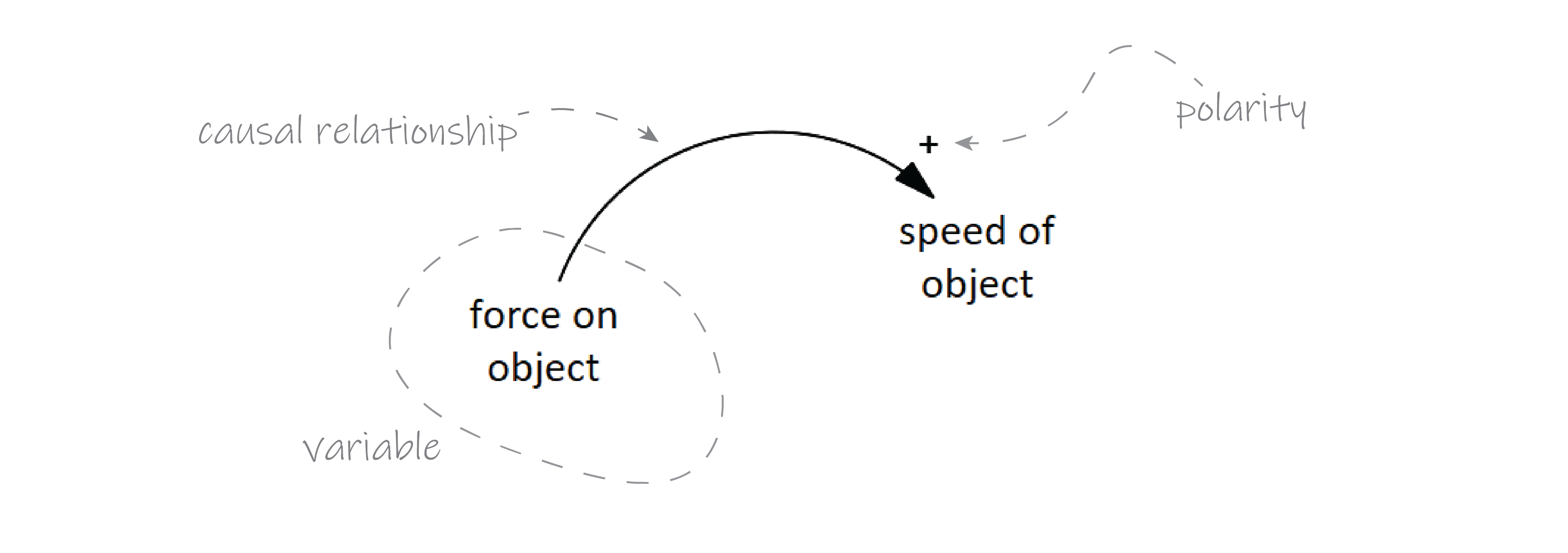
Where a quantitative model will tell you the exact numerical relationship between the two variables, a qualitative model does not. A qualitative model only tells us something about the direction of the causal relationship, which can be positive or negative.
A positive causal relationship is indicated with a plus-sign (+), and simply means that when the value of the cause (variable at the start arrow) goes up, so does the value of the effect (variable at the end of the arrow). Conversely, if the value of the cause goes down (the force in our previous example), the effect (speed) does too.
A negative causal relationship, indicated with a minus-sign (-), indicates that the direction is reversed. When the value of the cause goes up, the value of the effect goes down. But also; when the value of the cause goes down, the value of the effect goes up.
It takes some time getting used to interpreting this notation. Many people associate the plus-sign with increasing values, and the minus-sign with decreasing ones, but this isn’t the case! The signs only says something about the relationship between the variable values, it tells us nothing about the values themselves.
Why qualitative models are so useful
Recall that a qualitative model doesn’t inform us about how the exact value of a variable changes with respect to another. While this certainly limits the use of these models for things like setting a national tax rate or calculating the carrying capacity of an elevator, it allows us to make our models more ‘complete.’
First, it allows us to incorporate hard-to-quantify or subjective variables, such as happiness, well-being, stress, job satisfaction, etc. These things can only be approximated numerically, and are therefor unsuitable for empirical model analysis. We can still use them in qualitative models though, as long as we can prove the directionality of the relationships between them.
Second, we are more free in the causal relationships themselves. A quantitative model requires us to know the value of a variable, or the exact relationship it has with another so that it can be calculated. Any unknowns need to be excluded. For a qualitative model these rules don’t apply. Again, as long as we know the directionality of the relationship, we can include it in our model.
Feedback loops
The real power of qualitative maps lies in knowing the relationships between more, if not all the variables that are relevant to a system or case. Particularly, a loop of variables—called a feedback loop—give the system very interesting behavioural properties.
A positive or reinforcing feedback loop occurs when the increase in a variable ultimately leads to a further increase in that variable over time. To recognise them, count the number of plusses and minuses: are there only plusses and/or is the number of minuses even (a multiple of 2), than you’re dealing with a reinforcing feedback loop. In models, they are often indicated with a curved arrow in the centre of the loop, and denoted with a R- (reinforcing) or plus-sign.
Conversely, when there is an uneven number of minuses in a loop, we’re dealing with a balancing feedback loop. Here, the increase in one variable ultimately leads to a decrease in that same variable. Balancing feedback loops are also indicated with a curved arrow, but contain a B- (balancing) or minus-sign within.
An example of both types of loops is shown below, with a reinforcing loop on the right, and a balancing loop on the left.
When the global average temperature goes up, the permafrost melts, and less solar radiation is reflected back into the admosphere. Consequetly, as the earth absorbs this light instead, the global average temperature further increases.
However, as the average global temperature goes up, citicens become (hopefully) increasingly concerned and (hopefully) take and demand global climate action. This in turn slows down the rise in global average temperature.
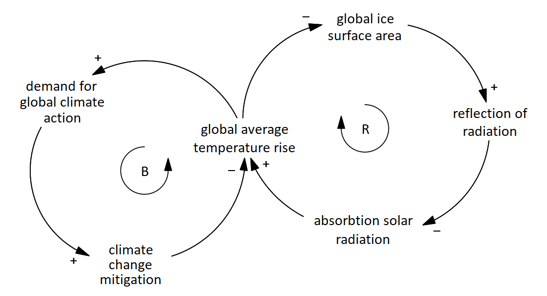
The example shows us something fundamentally important for system models. Namely that balancing loops make the system resistant to change whereas reinforcing loops make the system sensitive to change due to its amplifying nature.
As we will see in the article on leverage points, making changes in these feedback loops can be much more effective than making changes in some lone system variable. More so, changing the structure of these feedback loops can be even more transformative, introducing mechanisms to balance a reinforcing loop or vice versa, depending on the goal of the intervention.
I hope this article managed to teach you the basics of reading system diagrams. Do not hesitate to get in touch if you have comments or suggestions!